
- Saturation plays a crucial role in shaping perceptions, moods, and decisions in everyday life.
- Intense color saturation in markets signals ripeness and quality, building consumer trust.
- Artists like Van Gogh utilize saturation to evoke deep emotions and transform artworks into rich narratives.
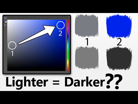
- In digital interfaces, saturation guides user interaction by attracting attention and influencing behavior.
- Saturation commands attention in a fast-paced visual culture, distinguishing essential content from the mundane.
- Saturation is more than color intensity—it’s a vital element in advertising, art, and digital media that influences human experience.
- Understanding saturation enables deeper insight into how we perceive and interact with the world around us.
Vivid hues explode like a canvas of emotions, painting the world around us with the eloquence of saturation. Saturation—often overshadowed—plays an unsung role, not just in art, but in the vibrant tapestry of everyday life. It shapes our perceptions, dictates moods, and even influences decisions.
Imagine strolling through a bustling market, the scent of ripe tomatoes tickling your nose. Your eyes dart to the juiciest, most intensely colored fruits—those that boast a deep, unyielding red. They beckon with the promise of flavor, their saturation whispering assurances of ripeness. Saturation here is not just a color intensity; it is a visual contract, forged between consumer and context, grounded in trust and instinct.
Artists have long known the power encapsulated in this secret of hues, wielding it deftly to evoke emotions. Consider Van Gogh’s “Starry Night,” swirling with intense blues and vivid yellows. These colors vibrate with life, each brushstroke a testament to a world not merely seen, but profoundly felt. The saturation transforms the canvas from mere depiction to a pulsating narrative of human experience.
This principle extends beyond art into our digital lives. Tech giants scrutinize color palettes with a meticulous eye, crafting digital interfaces that not only attract but gently guide user interaction. The saturation of a button invites clicks; the subtlety of a background color sets the tone for a user’s journey, all calculated to be intuitive yet imperceptibly influential.
In our rapidly evolving visual culture, where attention is the commodity, understanding saturation becomes paramount. Yes, saturate reality or digital interactions, and watch as it commands attention, dictates choices, and engages at a primal level. In a world flooded with imagery and information, it is saturation that delineates the vital from the mundane.
Here lies the core takeaway: Recognize saturation not only as a measure of color intensity but as a pivotal element that shapes our daily interactions and perceptions. From a strategic advertisement to a cherished piece of art, saturation weaves its indomitable influence, urging us to see beyond the surface into a deeper psychological realm.
So next time you glance at a painting, or swipe through your smartphone, remember—saturation is not just decorating the world; it’s defining it. Explore this colorful concept, and you just might see the world a little differently—a touch more saturated with meaning.
Unlocking the Hidden Power of Saturation: Why It Matters in Art, Advertising, and Beyond
Exploring the Depth of Saturation in Everyday Life
Saturation is more than a simple intensity of color—it’s a powerful, emotional force that shapes our perceptions and interactions every day. In contexts varying from art to advertising, understanding and utilizing saturation can transform mundane experiences into profound encounters. Yet, there’s much more to discover about saturation than we typically dive into.
Real-World Applications and Insights
1. Advertising and Branding:
– Businesses leverage saturation to elicit specific consumer responses. Bright, saturated colors catch attention and convey energy and urgency, essential in platforms like billboards and digital advertisements. According to neuropsychological research, colors can impact buying decisions by up to 85% (Source: Psychology Today).
2. User Experience Design:
– In the realm of digital interfaces, saturation is utilized to influence user journeys. Highly saturated call-to-action buttons stand out, ensuring that users follow desired pathways smoothly. Designers must find the balance between saturation and readability, avoiding visual fatigue or overwhelming the user (Source: Nielsen Norman Group).
3. Cultural Influence:
– Saturation is perceived differently across cultures. In some Asian cultures, bright and saturated tones symbolize prosperity and celebration, while in Western cultures, muted tones can indicate elegance and sophistication.
4. Psychological Effects:
– Colors with high saturation levels often evoke excitement, while less saturated colors induce calm. This can be strategically applied in environments like hospitals and spas to enhance relaxation, or in gyms and retail stores to boost energy levels.
Controversies and Limitations
– Over-Saturation:
– Using too much saturation can overwhelm the viewer and reduce overall visual clarity. It requires skill to manipulate saturation in a way that enhances rather than distracts.
– Perceptual Differences:
– Individual responses to saturation can vary significantly, depending on personal preferences and even color blindness considerations, making universal application challenging.
Actionable Tips for Utilizing Saturation
– Designing Your Space:
– Employ highly saturated colors in focal points to energize living spaces while keeping backgrounds and large areas less saturated to maintain balance.
– Creating Art or Craft:
– Experiment with varying saturation to convey different moods. Start with a palette that combines both saturated and desaturated shades to achieve depth and emotion.
– Marketing Strategy:
– Test different levels of saturation in digital ads to find optimal engagement for target audiences. Utilize A/B testing to determine the most effective saturation levels for your specific demographic.
Conclusion
Utilizing saturation effectively requires a nuanced understanding of its impact on human perception and behavior. By mastering this element, whether you’re an artist, a marketer, or a designer, you can enhance experiences and deepen connections with your audience. Embrace the vibrant world of saturation, and start coloring your surroundings with intention and purpose.